
On this episode of America’s Commercial Real Estate Show, Tom French, President of The Hospitality Group, joins host Michael Bull to discuss the hospitality / lodging sector. Among the topics discussed are sector health, RevPAR (revenue per available room) trends, buyer and seller cycle concerns, investor opportunities that may exist, hospitality property market trends, developments in hotel financing, lender options, underwriting, property owner types, hotel PIPs, owner and seller tips, and service performance.
Video: The Hospitality Group’s President Tom French Discusses Whether it is Time to Sell Hotels
0 Comments
Video: CCIM Institute Chief Economist KC Conway on Economic Drivers for Amazon HQ2 Site Selection
In this video, KC Conway, Chief Economist at the CCIM Institute, joins the show host to discuss site selection in the economy, including United States site selection changes, workforce impacts to site selection, Amazon’s reasons for site selection including for its HQ2 site selection process, the United States economic Golden Triangle, and finally Amazon HQ2 site predictions. He goes through some of the line items in the Amazon HQ2 RFP. Orlando, Florida makes his top five most likely list, but not Miami, which he dismisses as a head fake.
0 Comments
Handicapping the End of the Economic Recovery for Commercial Real Estate Investors
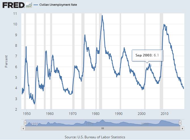
United States Civilian Unemployment Rate from January 1948 to April 2018
“It’s tough to make predictions, especially about the future.” ~Yogi Berra
In the accompanying chart of the United States civilian unemployment rate from January 1948 to April 2018, one can clearly see that the economic recovery we are currently in, if defined by a drop in unemployment, is one of the longest and most pronounced in modern history. This is an element of the Goldilocks environment for commercial property investors, a solid economy driving rents up and vacancy down while interest rates – although in the upper end of their range for the prior decade – remain relatively low.
“If something cannot go on forever, it will stop.” ~Herbert Stein
The intuitive sense in looking at this chart is that is should have been obvious at each bottom that unemployment would soon uptick. In reality, it isn’t so obvious in the moment. Like with many things, you don’t know it is over until it is. As is wryly said, it ain’t over until its over.
What is indeed noticeable in this period is that the unemployment rate is near its lowest bottom but for the one in the fifties, and in all fairness the post WWII era of bobby socks and carhops seems less relevant. The drop from unemployment’s high point of 9.9% in late 2009 down to 3.9% in April 2018 is a standout 6 percentage points. Of the recoveries represented in this chart, only one comes close, the 1983-89 recovery during which the country enjoyed a 5.8 percentage point decrease. Also note that each time the unemployment rate has bottomed, in run up (in the unemployment rate) is fast, furious, and surely met with societal angst. Those with a more academic bent are sure to scoff at what is essentially a sure-looks-it notion, preferring to pay attention to things more ivory tower worthy like a flattening yield curve as potential predictors. The retort? It sure looks it.
“The future ain’t what it used to be.” ~Yogi Berra
So what does this mean to commercial real estate investors? First, they have been in a great environment for ownership. Whether that will continue is anybody’s guess. On the plus side, this recovery is already beyond the norm, thus it isn’t unreasonable to think that it could go on for a while longer. I certainly have no idea. Some would say this long run is only a sign that it is about over. Eventually, they’ll be right. A slowdown is not good for vacancy rates or rent growth, and thus negative for property values, but at least should lead to a less tight credit market, likely good for property prices, perhaps acting to cushion some of any negative effect. Further, Miami area investors also have the luxury of ownership within one of the more exciting and fast growing locales, now with the third most dense skyline in the United States and within a state that nearly a thousand people move to each day.
Related:
- St. Louis Fed: Cyclical asymmetry in the labor market
- Considering Cap Rates and Potential Effects on Values as the Interest Rate Environment Changes
- Nareit: Property Prices and Cap Rates in a Rising Interest Rate Environment
- The Leveraging Effect of Occupancy/Vacancy on Net Operating Income
- Chart: Putting Recent Rate Increases in Historical Perspective
- Commercial Borrowing Cost Quarterly – 2018 Q1
- Yield Curve Quarterly Snapshot – 2018 Q1
- Video: Jim Costello of Real Capital Analytics on Business Cycle, Interest Rates Impact on Retail Real Estate
- Cap Rates and Real Estate Cycles: A historical perspective with a look to the future
- This Downtown Miami Development Pipeline Animation Will Blow Your Mind
- Miami Boasts Third Densest Skyline in United States
- Considering a Flattening Yield Curve and Implications for the Economy
This Downtown Miami Development Pipeline Animation Will Blow Your Mind
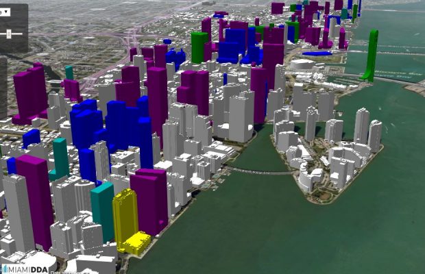
Click to access interactive animation of downtown Miami’s development pipeline.
You may have read here or heard otherwise that Miami boasts the third most dense skyline in the United States. Much of this growth happened in the period from 1990 to 2016, as can be see in this animation. What you may be less aware of is that another such period of growth, this time of top of prior growth, is on the horizon.
The Miami DDA (Miami Downtown Development Authority) has released an interactive tool to visualize this. at this rate, one has to wonder how long it will be before Miami passes Chicago to go into the number two position for skyline density.
0 Comments
Video: Director of Leasing at Hines on retail tenant success in today’s changing environment
In this video, Nick Grazia, Director of Leasing at Hines, appears on America’s Commercial Real Estate Show, discusses the retail sector with an emphasis on maximizing tenant success. This includes tips for landlords, helping tenants, Yelp and other reviews of tenants, mall REITs, retail operator issues, franchisee relations with franchisors and their landlords, and retail landlord and tenant rep relations.
Hines, per its website, is a privately owned global real estate investment, development and management firm that was founded in 1957. It has a presence in more than 200 cities in two dozen countries and $111 billion of assets under management, which includes $60 billion for which Hines provides fiduciary investment management services and $51 billion for which Hines provides third-party property-level services.
0 Comments
Video: Reis Economist Barbara Denham on U.S. Office Market Performance and Economic Outlook
Barbara Denham, Economist at Reis, makes an appearance on America’s Commercial Real Estate Show to discuss office property market performance. Among the topics discussed are rent growth, interest rate changes, job growth and its impact on office market performance, the impact of shared space models, economic and global markets impacts, office property supply, the best markets for vacancy rate, office growth outlook, and interest rates.
0 Comments
Video: Survey on Open Floor Plan vs. Private Offices ~ Those Not Fans of Open Far from Alone
In this video, Marketing Communications Specialist Diana Sabau discusses a recent survey she performed asking employees from various age groups and in various industries. The survey questioned how they felt about office layouts. In particular, she wanted to find out preferences regarding open floor plans – if you’re not a fan I think you’ll be stunned at how much company you have – as opposed to private office space. She also queried regarding office space preferences, work environment preferences, office issues, employee expectations, privacy needs, square footage demands. Finally, she shares tips for creating a positive work environment.
0 Comments
Chart: Florida Just Ahead of Georgia as Leading Exporter to Cuba
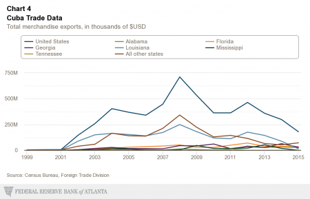
Looking at the first chart herein, one can see that among U.S. states Florida exports the most to Cuba in the most recent year (2015), albeit with less margin versus number two ranked Georgia that one might guess. Florida’s near $35 million in exports, presumably much of which originates from Miami, represents 18.8% of a total of $180 million in exports by the USA as a whole.
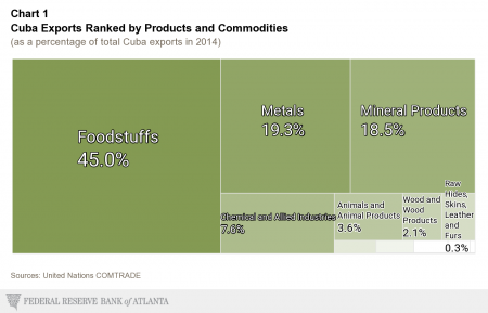
There are a number of interesting charts in the full post by the Americas Center of the Federal Reserve Bank of Atlanta, such as this second one breaking down the product and commodity mix of exports to Cuba. View all the charts and read their full post here.
0 Comments
Chart: The Ever Tightening Miami Industrial Market
A recurring theme of late in our commercial real estate brokerage practice is that of difficulty in finding mid-range industrial property, from 10,000 to 30,000 square feet, to purchase. Anecdotally, it has been obvious for a while that the demand for such property is notably disproportionate to the modest supply. This bears out in low vacancy rates, but that alone didn’t seem to tell the full story to what we’ve been observing, an ever tighter industrial market squeezed by population growth and related growth in commerce, the increasing allocation of land for housing and other uses generally more desirable (than industrial) to community leaders, and the gators-to-the-left-waves-to-the-right geographical constraints of South Florida.
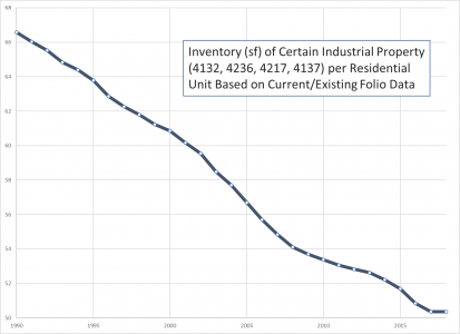
While residential units have grown with Miami’s population, some industrial type properties have lagged, resulting in less square feet of such property per residential unit.
The accompanying chart shows the total square footage in Miami-Dade county for certain types of industrial properties, those represented by a land use code of 4132, 4236, 4217, or 4137, general light manufacturing and distribution type properties, per the total number of residential living units. This isn’t perfect. For example, any properties not in service today that were in the past would not be included, as this is based on current folio data. However, this would affect the numerator aggregate industrial square footage as well as the denominator, residential units. Also, some may wish to use other types of properties as a more representative class, but this is at least a representation of some class of industrial properties. Regardless, we would believe this is fairly representative chart. Most notably, its black diamond ski slope shape matches our anecdotal experience that can be summarized with an owner’s two words, “seller’s market.”
Related Resources:
Considering a Flattening Yield Curve and Implications for the Economy
In a recent Business Insider article, the indicator with an almost perfect record of predicting US recessions is edging towards a tipping point, Macquarie Bank was quoted, “The yield curve has inverted within the 24 months preceding each of the past five recessions, and has only inverted once without a recession following in the ensuing two years.” That, folks, is a record worthy of attention.
So let’s look at what has been happening with the yield curve, paying particular attention to the spread between the 2-year and 10-year treasuries, generally observed as the most relevant single gauge.
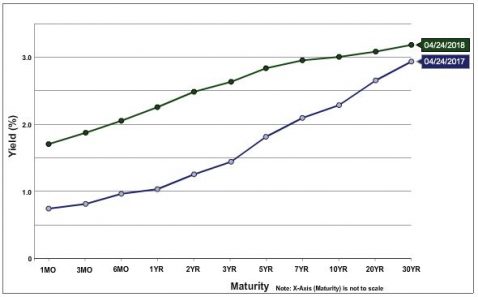
U.S. Treasury Yield Curve April 25, 2018 vs. One Year Prior
Above is a chart of the U.S. Treasury Yield Curve on April 25, 2018 versus one year prior. The flattening can be observed in the proportionately higher increase in rates in the short end (green line is new), with rates increasing near 100 bp for most shorter maturities, while longer-term maturities increased, but significantly less.
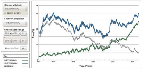
Historical Two and Five Year U.S. Treasury Yields and Differential for the Five Years Ending April 25, 2018
This flattening of the yield curve can be observed directly in the second chart, Historical Two and Five Year U.S. Treasury Yields and Differential for the Five Years Ending April 25, 2018. In this chart, the grey “differential” line can be observed to steadily decline. In the aforementioned BI article, this trend is judged to be heading toward a 2019 meeting with zero, i.e. a flat yield curve.
Macquerie Bank notes this as happening reliably up to two years prior to the beginning of a recession, not necessarily immediately preceding one. Thus, if all this holds, this would seem to indicate some likelihood of a recession in one to three years, a year for the spread between the 2-year and 10-year US Treasury rates to compress, then up to 2 years for the predicted recession to begin. The yield curve flattening could, however, flatten or even reverse, and the indicator could strike out this time. Time will tell, but of course the wisdom of economist Herbert Stein is bound to bear out in the end; if something cannot go on forever, it will stop.”
Chart: Putting Recent Rate Increases in Historical Perspective
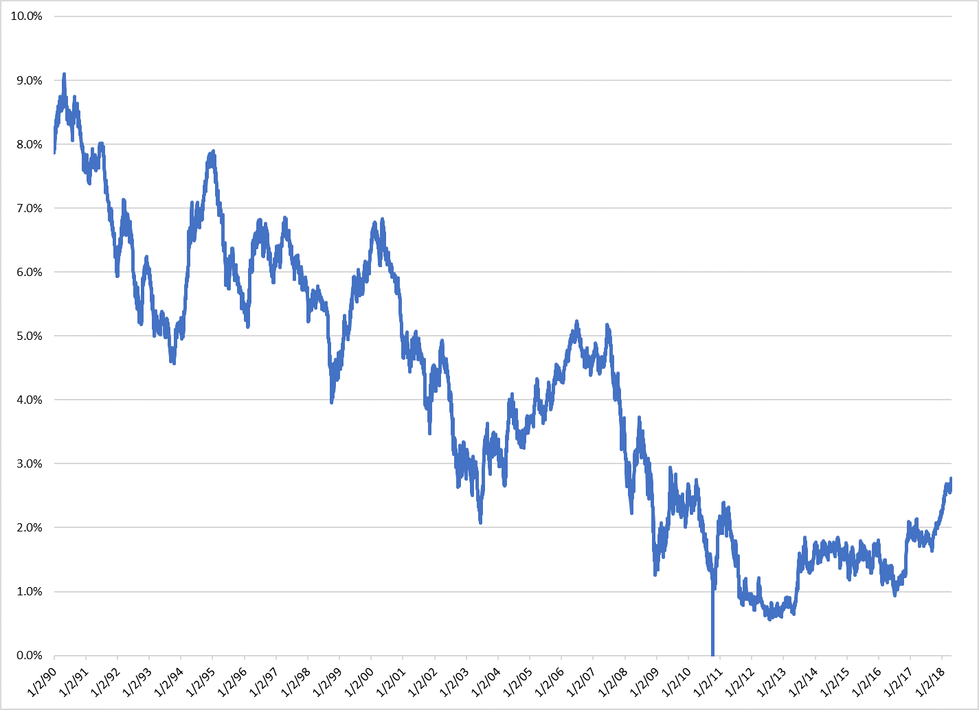
5-Year United States Treasury Rates from January 1990 to April 2018
Given the rise of late in interest rates, it seemed an opportune time to put rates, particularly those of the 5-Year United States Treasury most closely linked to commercial property borrowing rates, into perspective. The accompanying chart, “5-Year United States Treasury Rates from January 1990 to April 2018,” gives a nice visual perspective. In this chart, it is immediately apparent that this rate, and thus commercial property borrowing cost, has crept up a general range not seen since 2011, but still is comfortably below ranges from which is declined steadily since 1990.
Related Resources:
Chart: Fed Funds Rate Breaks Out of Near Zero Range Most Familiar to Many
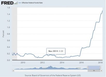
Effective Federal Funds Rate in +/- 10 Years to April 19, 2018
Assuming a person becomes financially / economically aware around the age of 22 (I can hear the chorus, “if at all”), then anyone born after 1985 has only known a near zero short term interest rate environment. Even those older than this to a degree seem to have begun to taken it for granted. As can be seen in the accompanying chart of the effective federal funds rate for the past 10 years or so, this is changing.